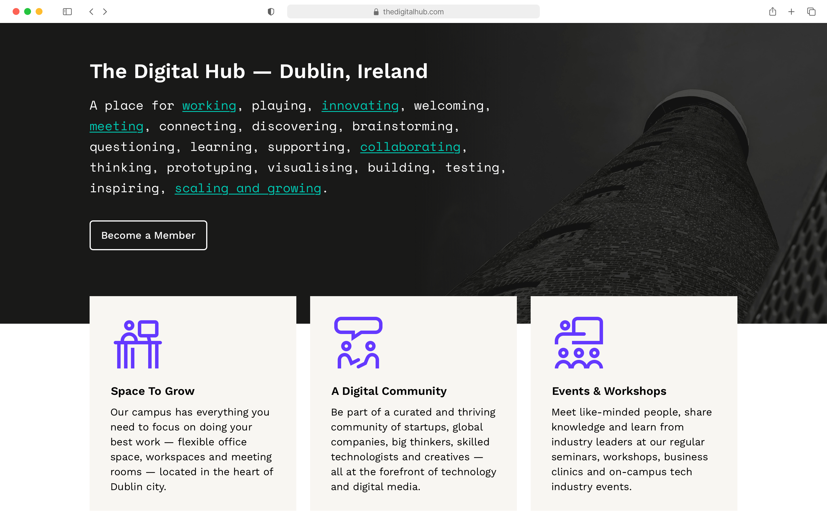
The Digital Hub
Helping the Irish state agency to reshape their brand and pivot strategically for the future.
Client
Digital Hub Development Agency
Agency
PixelSoup
Deliverables
Creative direction
Content strategy
Wireframes & prototype
User experience
Website design
Icon design
Pivoting for the future
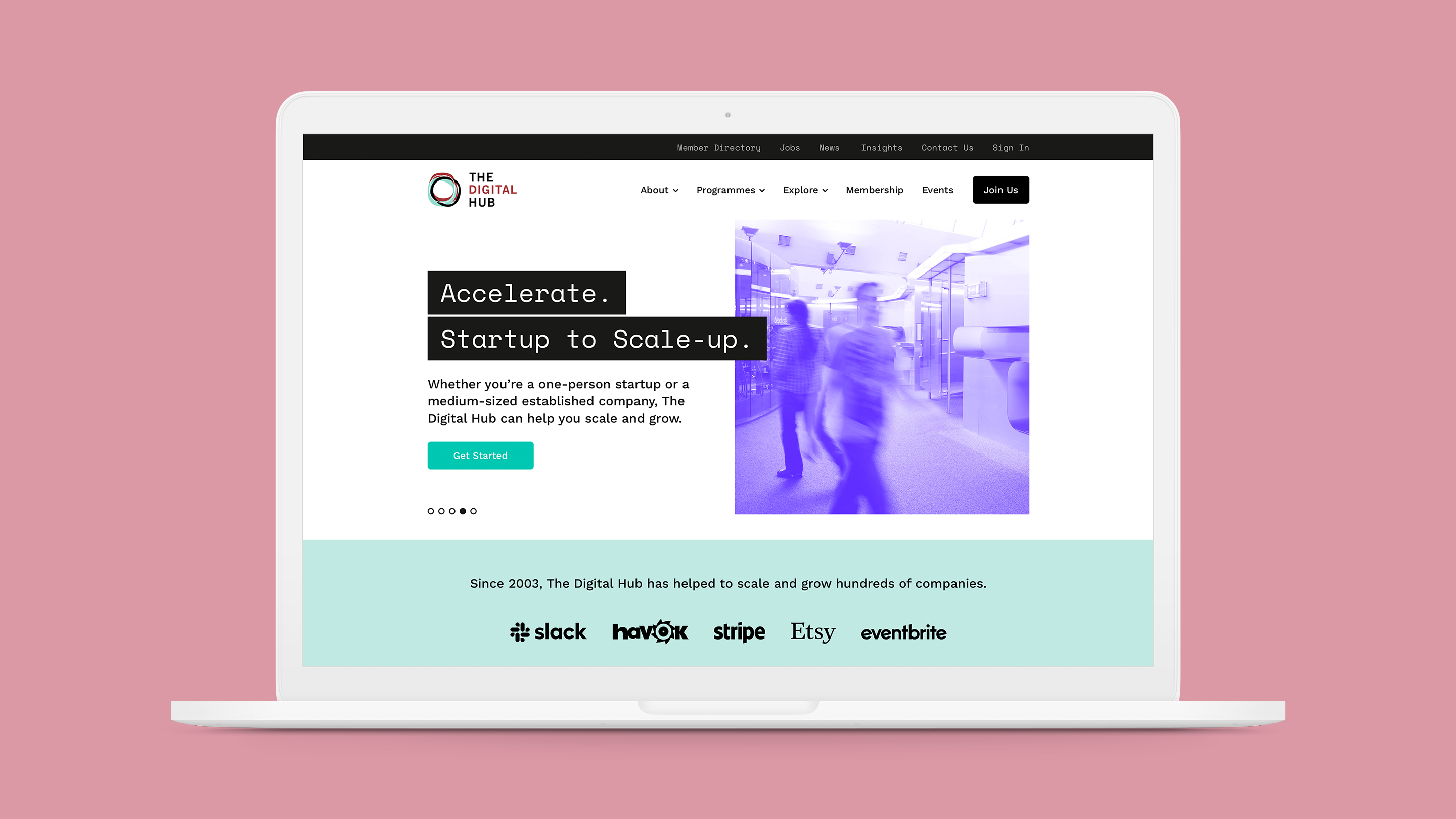
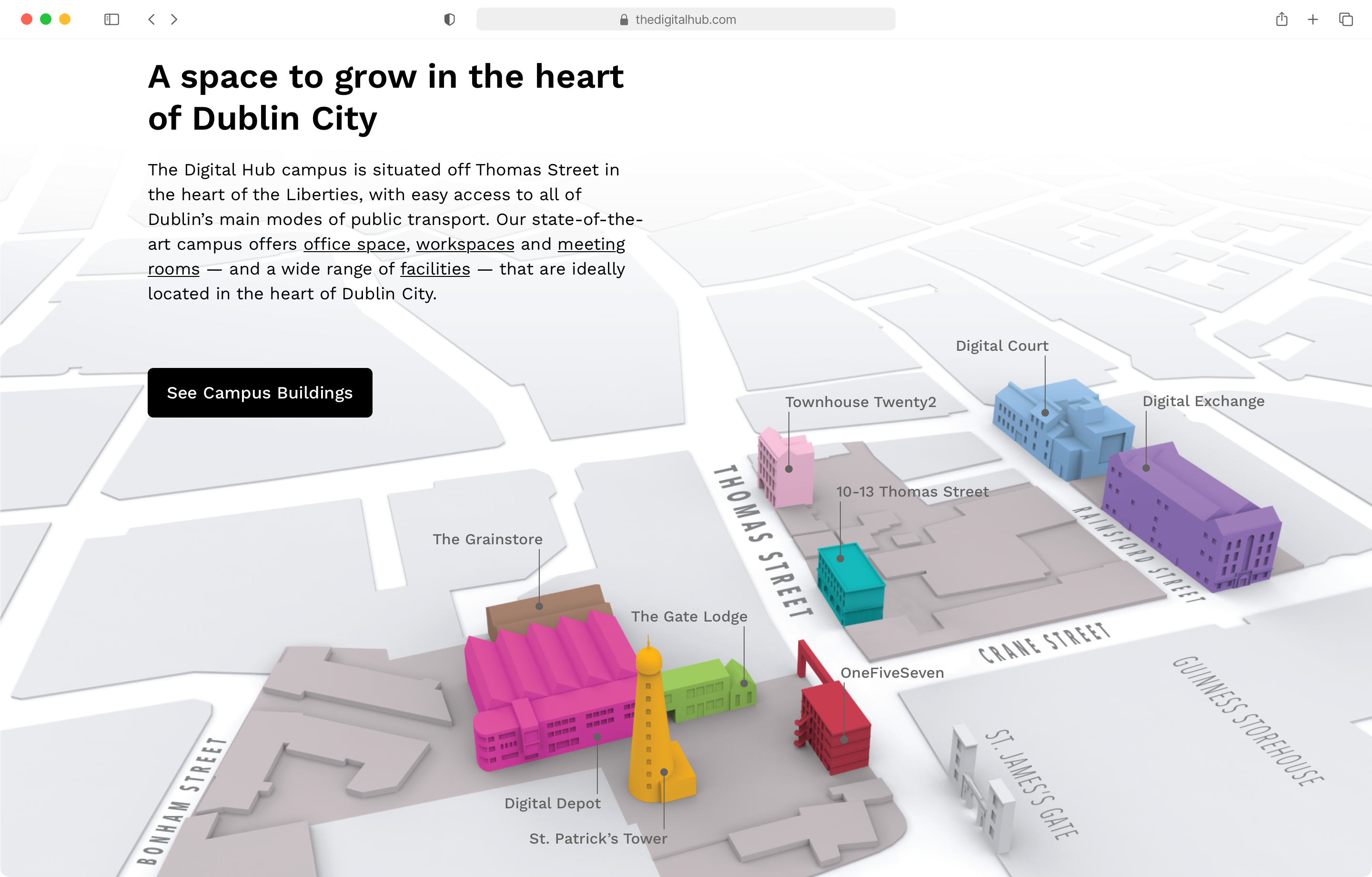
The Digital Hub Development Agency runs and manages The Digital Hub, a leading cluster of technology and digital media companies in Ireland. Working closely with the marketing and client services teams in the Digital Hub Development Agency, I led the user experience and visual design of their relaunched website. I helped refine and visualise key end-to-end user journeys, to give potential members clearer visibility of the campus spaces, facilities and member options. The graphic language of the brand was expanded to help carry the brand seamlessly across the full scope of the user journey.
A key challenge was to give ease of access to the wide range of campus facilities offered for professionals, partners and public alike, whilst also building a sense of value, support and engagement by better promoting programmes, events and member activities and highlighting collaboration with the local community.

Questioning, researching, understanding
Stakeholder meetings with Strategy, Marketing & Communications, Client Services & Sales, Community Learning Initiatives, Accounts & Finance and Operations were undertaken to define requirements and outcomes.
The overall strategy, site purpose and challenges were defined, alongside website features, assets, content and associated timelines. Personas and user journeys were reviewed. Customer-facing, member-facing and administrator-facing tasks, processes and jobs-to-do were considered.
A user-centered experience
Improved user experience was a high priority from the project team. The new website had to provide a meaningful and relevant experience to visitors, integrating key aspects of branding, design, content, usability and function.
A review of both existing and proposed content was undertaken, and a content inventory created. This content was then organised and classified, to build a website hierarchy for user-friendly navigation and to help users discover the information they need quickly. Clear information architecture connecting users with contextual content was outlined, and designed for growth and to be easily scalable.
UX writing was undertaken to make content easy to understand and actionable.
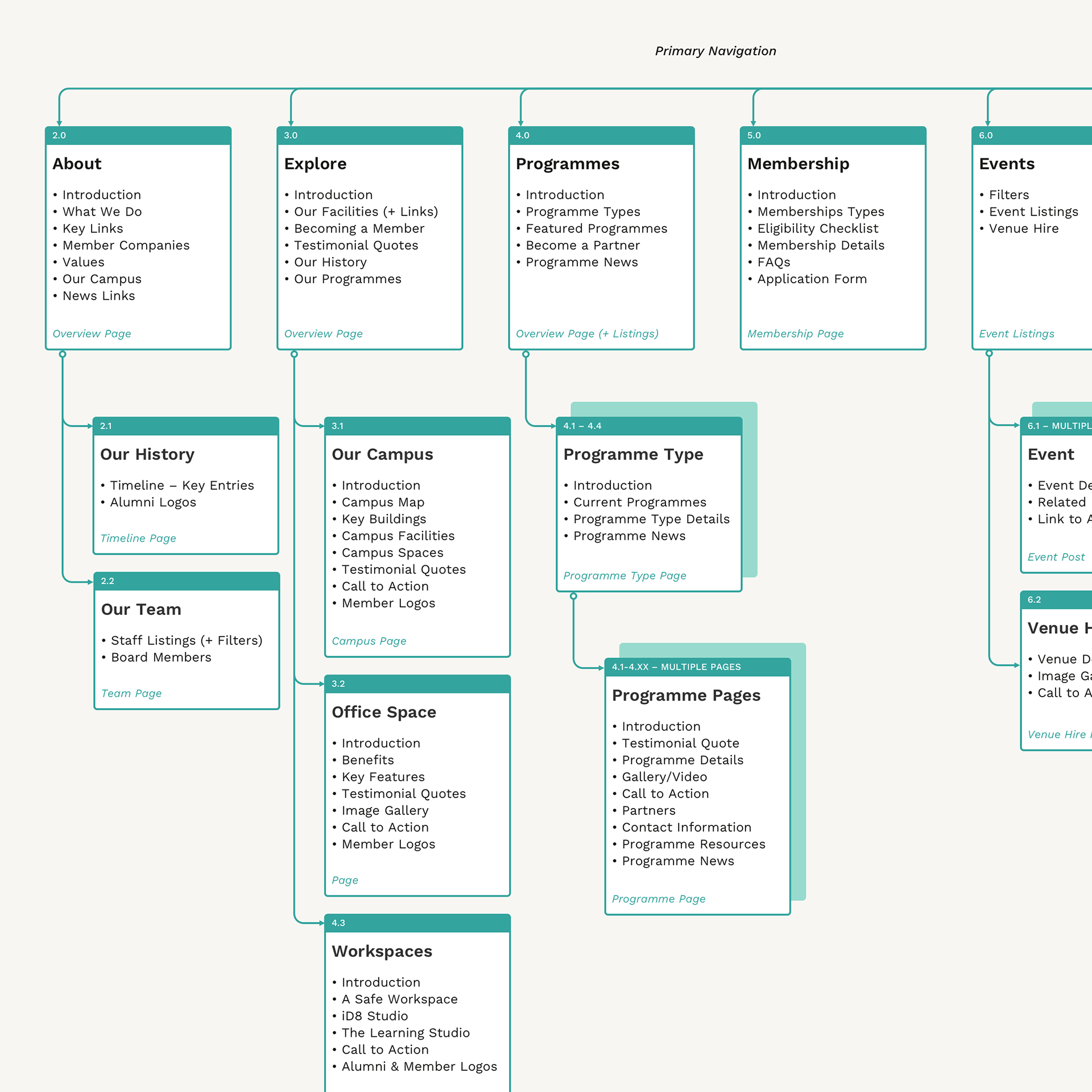
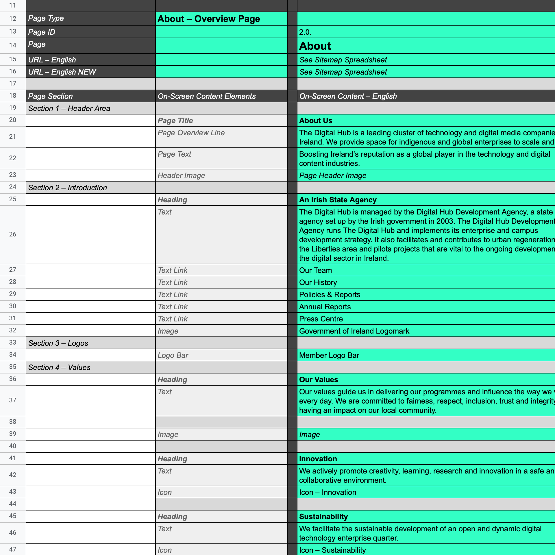
Sitemap and page structure iteration with accompanying content documentation
Key user tasks were identified and put front and centre for improved usability
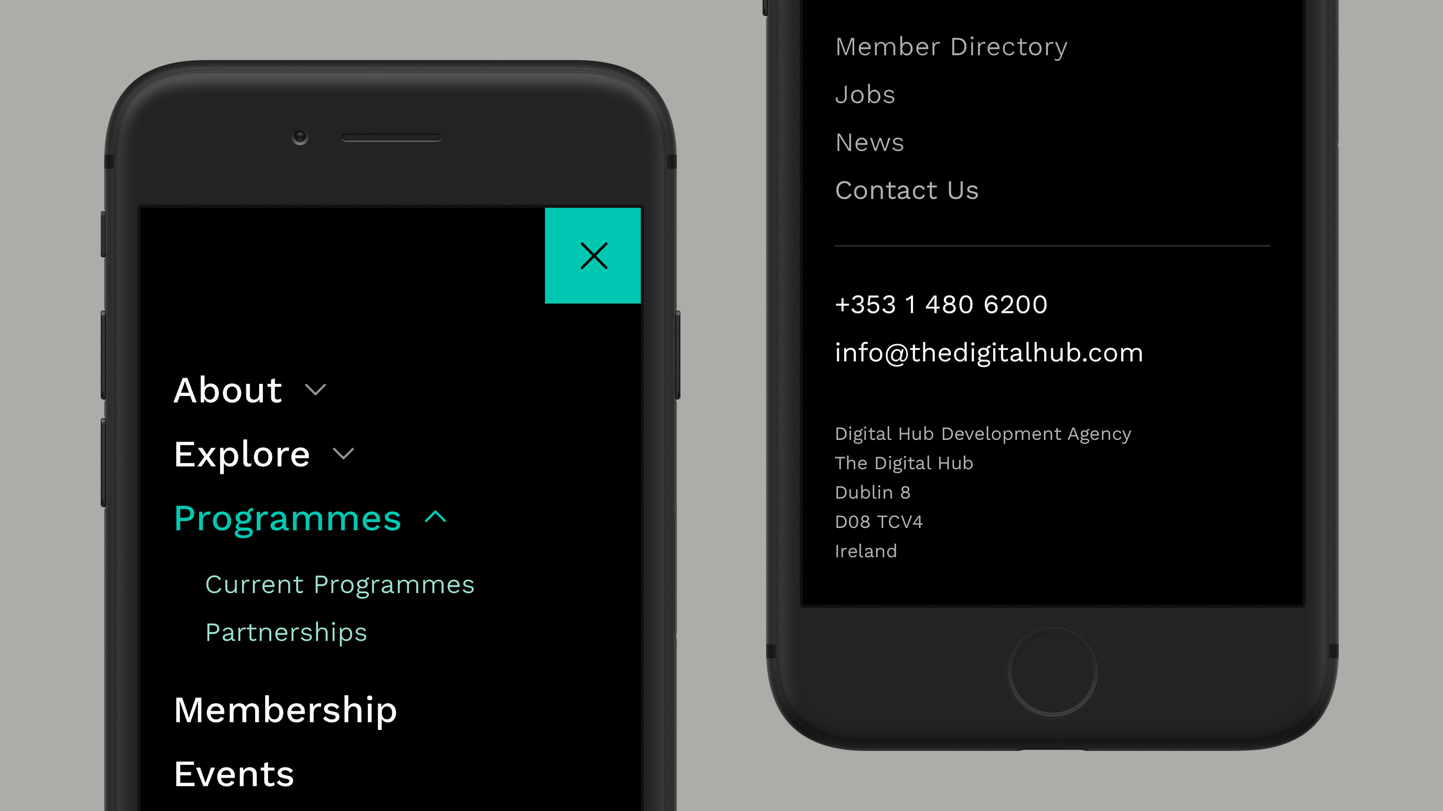
Optimised navigation
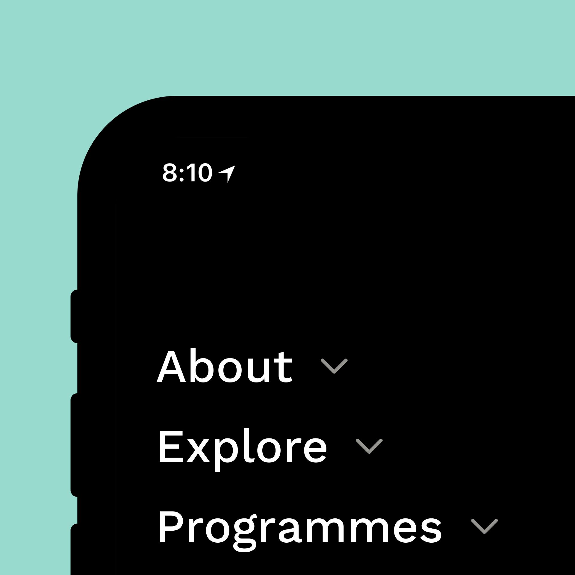
Improved website navigation was a key priority to avoid people getting lost or frustrated with the website. Key user needs were identified, and a simple clear navigation design was implemented to create a helpful user experience, letting online visitors know where to go and what to do.
The website navigation was redesigned to:
• Create a helpful user experience
• Be more mobile-friendly
• Increase visit duration
• Reduce bounce rate
• Improve conversions
Interlinking across internal pages on the website was increased to make it easier for visitors to explore additional content. Key call-to-actions are displayed across the website to allow visitors to take action.
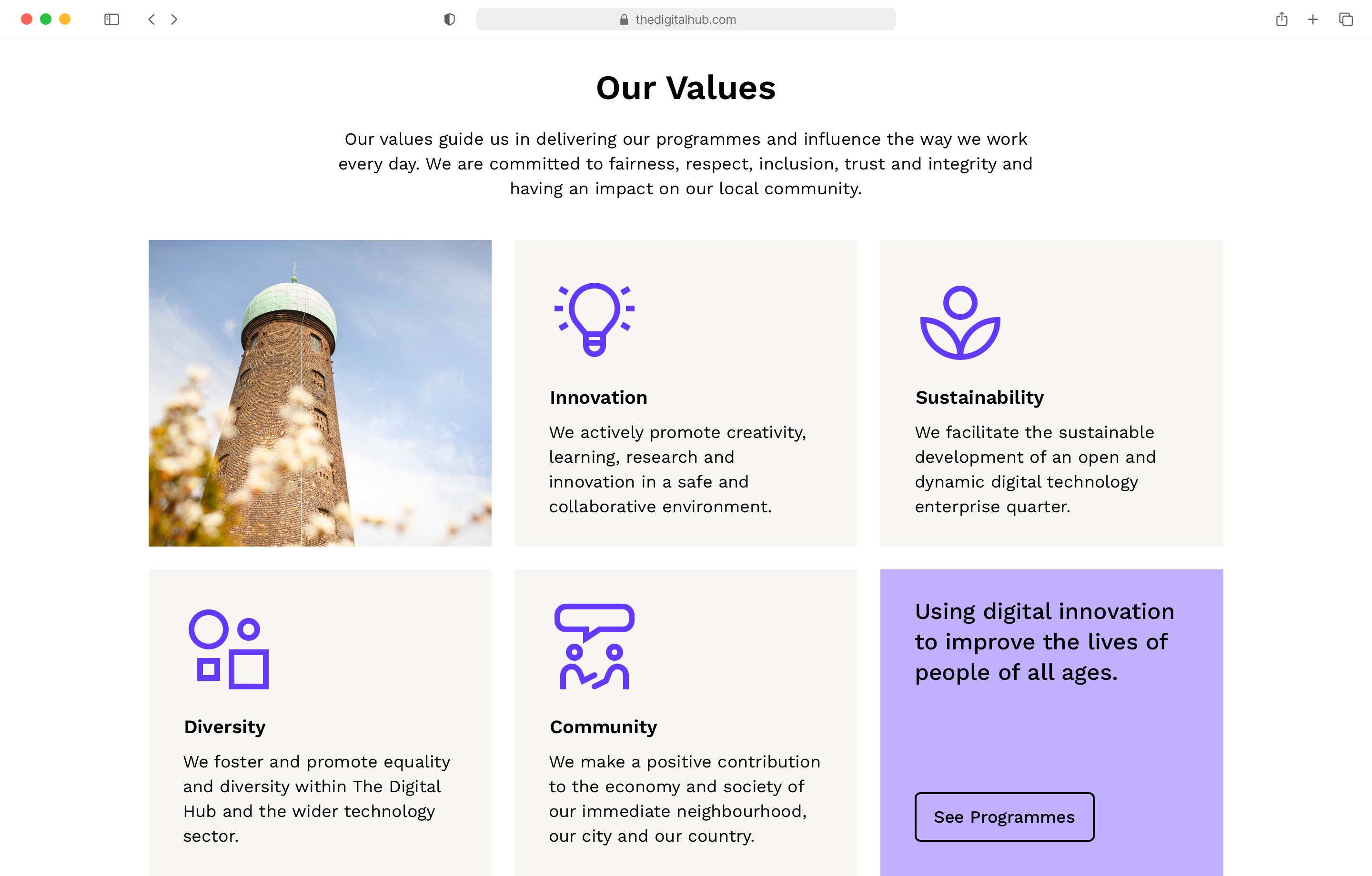
An expanded colour palette
The existing brand palette was expanded to allow for greater flexibility and variety. This range included new colour tints and shades — vibrant colours to be used on interactive elements such as buttons and UI components — with additional secondary colours introduced, all to better work across all applications, on screen and off.
Turquoise
#98DBCE
Turquoise – Vibrant
#00C7B1
Turquoise – Deep
#34A49E
Red
#DB98A5
Red – Vibrant
#C70016
Red – Deep
#A4343A
Indigo
#B19CFF
Indigo – Vibrant
#6439FF
Indigo – Deep
#4E00C7
Blue
#85D4FF
Blue – Vibrant
#0BA9FF
Blue – Deep
#0076DF
Yellow
#FFFF9C
Yellow – Vibrant
#FFFF00
Yellow – Deep
#FFB433
Sandbox
#F8F6F2
10%
20%
30%
40%
50%
60%
70%
80%
90%
Black
Typography
The Digital Hub provides an intersection between people and technological innovation, and a typographic pairing was chosen to reflect this positioning and highlight the human/computer and past/future connections.
The Work Sans family — a sans-serif influenced by early grotesques — from Google Fonts was used to complement the geometry and structure of the existing logo, while adding its own personality. The font features are simplified and optimised for on-screen text usage.
The open-source monospace typeface Space Mono, designed by Colophon Foundry, was chosen as a good pairing for Work Sans. It was created as a “monospace-first, monospace-only” design, with the letterforms based on a geometric foundation infused with grotesque details. It was developed for headline and display typography.
Iconography
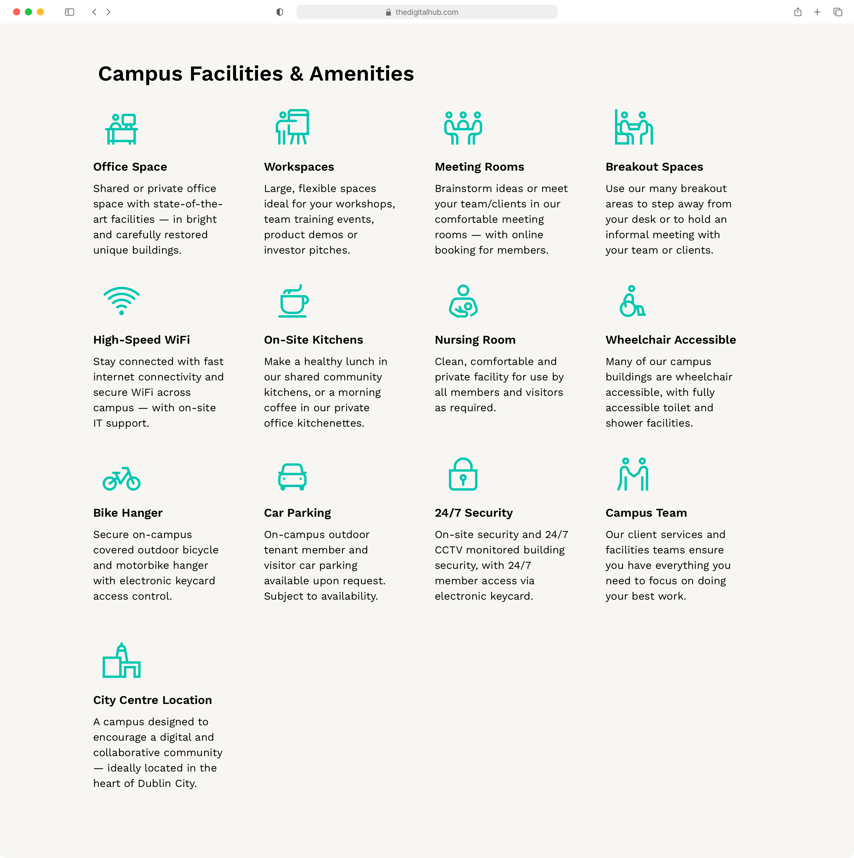
A custom set of illustrative icons were designed to help to tell the story of The Digital Hub — to inform users of what is on offer and reflect what happens at the technology campus. These icons help to provide additional visual context and bring meaning — offering a form of "visual shorthand" that helps to lower cognitive load and better utilise space, while adding visual interest to webpages and marketing material.
Simple stroked icons were used to mirror the rings visible in The Digital Hub logomark. The roundness of the logomark is reflected in the strokes of the icon set, with icons using a combination of rounded and sharp corners, and strokes having a mixture of rounded and butt-cap terminals — to portray a friendly industrious look.
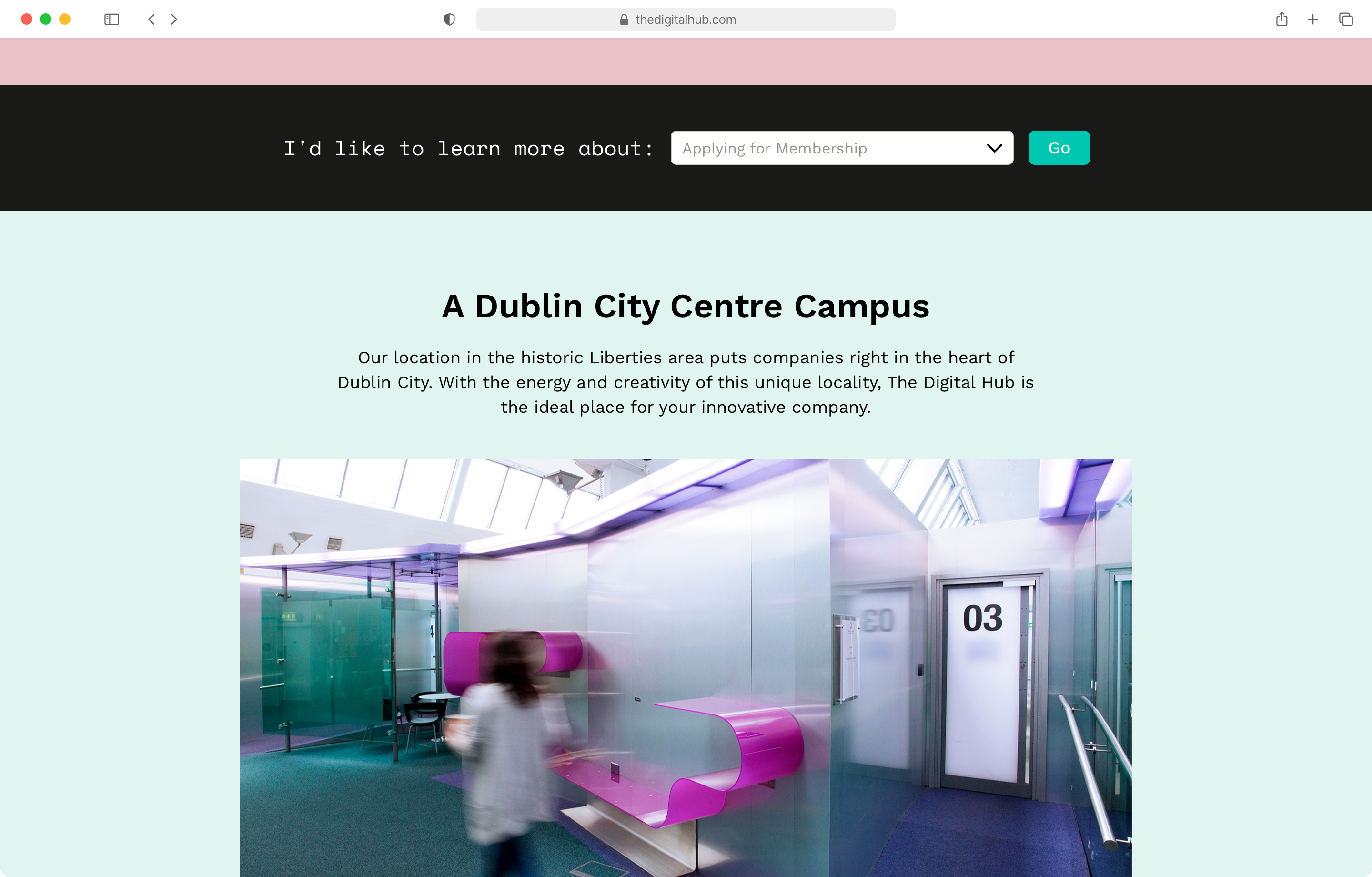
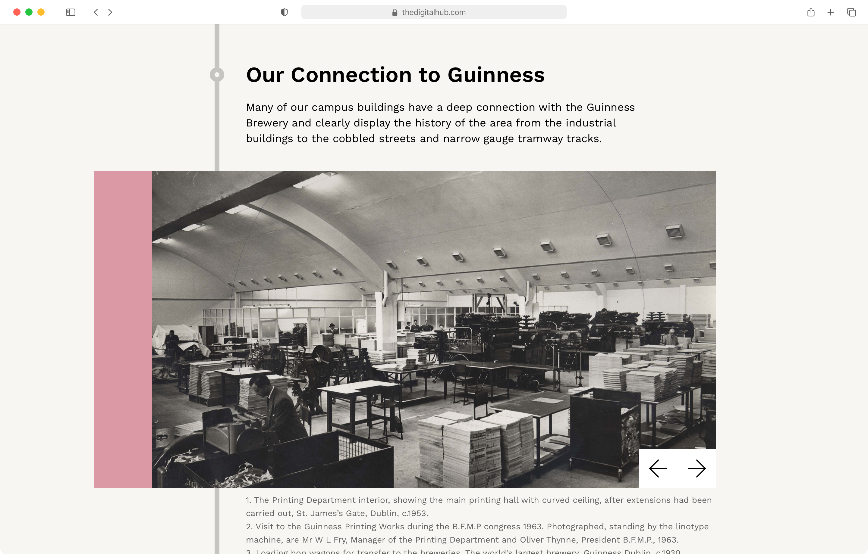
Where the past and future meet
The Digital Hub campus is located in the Liberties, one of Dublin’s oldest and most historical districts. A specific section of the website highlights the historical aspects of the campus, its historical townhouses and restored industrial buildings, all carefully restored and redesigned to encourage a collaborative future thinking digital community.

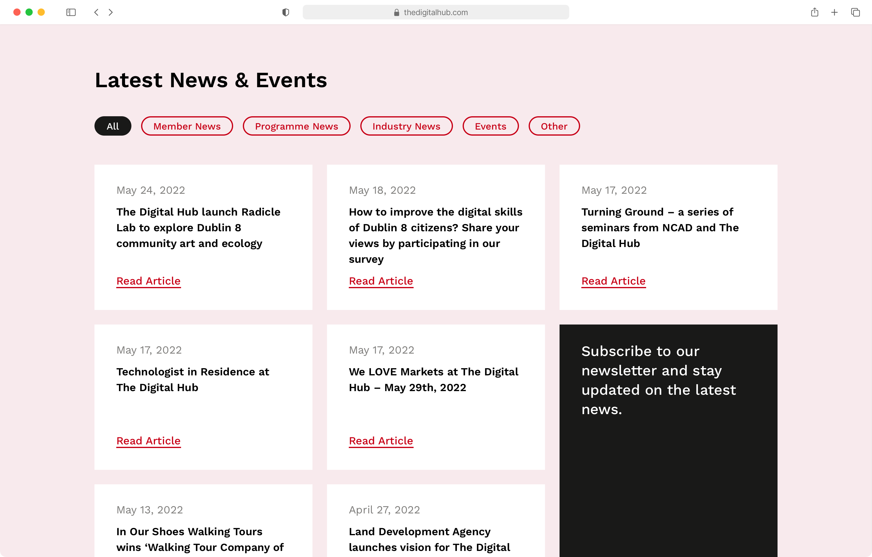
Keeping you up-to-date
A more streamlined news section was designed for more regular up-to-date information, with quicker more efficient functionality on the backend to allow staff to make updates quicker and more easily. A clean minimal mobile-first design — with filterable content and related articles prompt users to engage with similar content — ensures visitors can find whatever they need from whatever device they have.
Helping to enhance the digital face of the brand and connect with innovative companies looking to scale and grow.
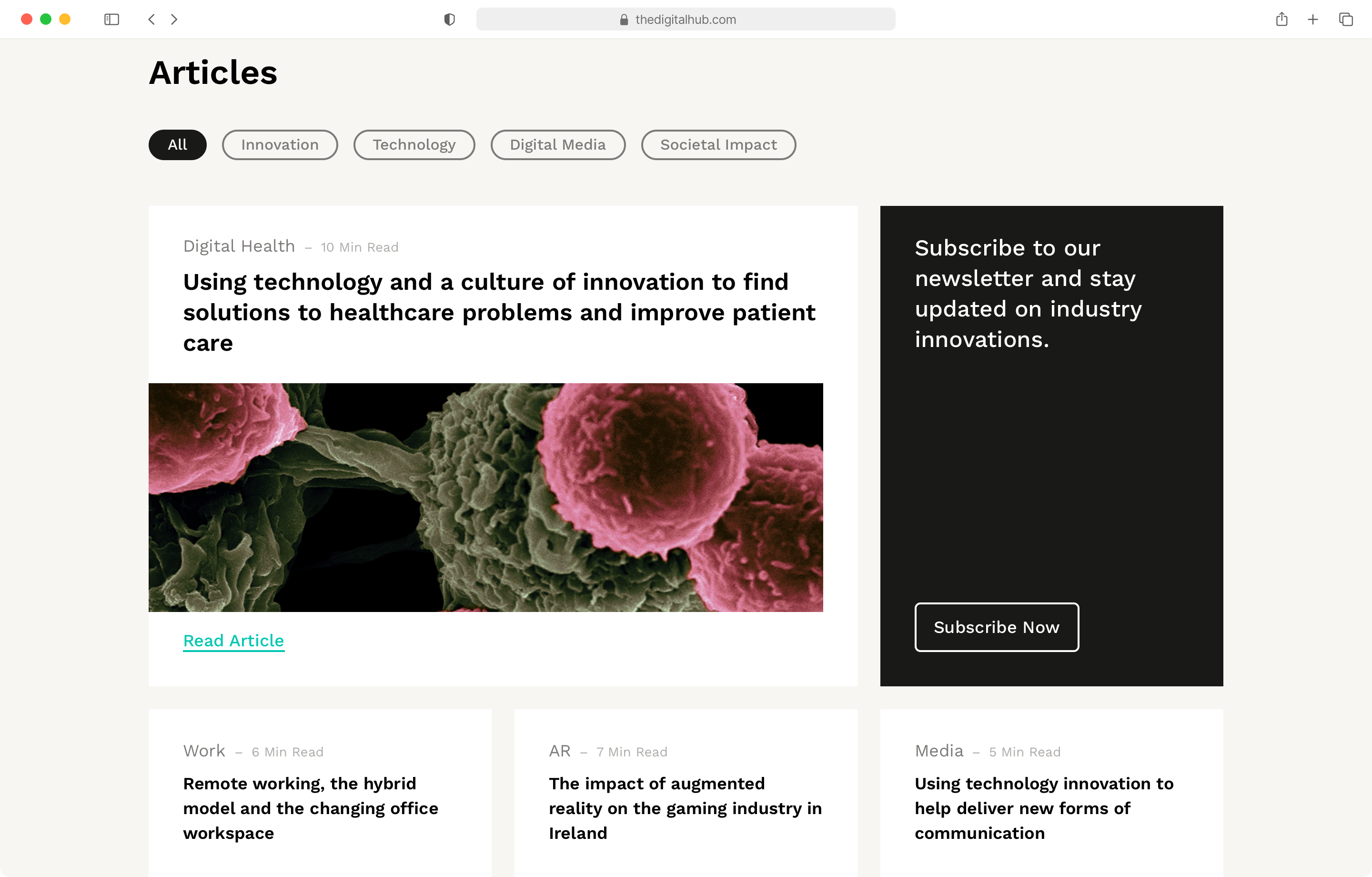
Improved access
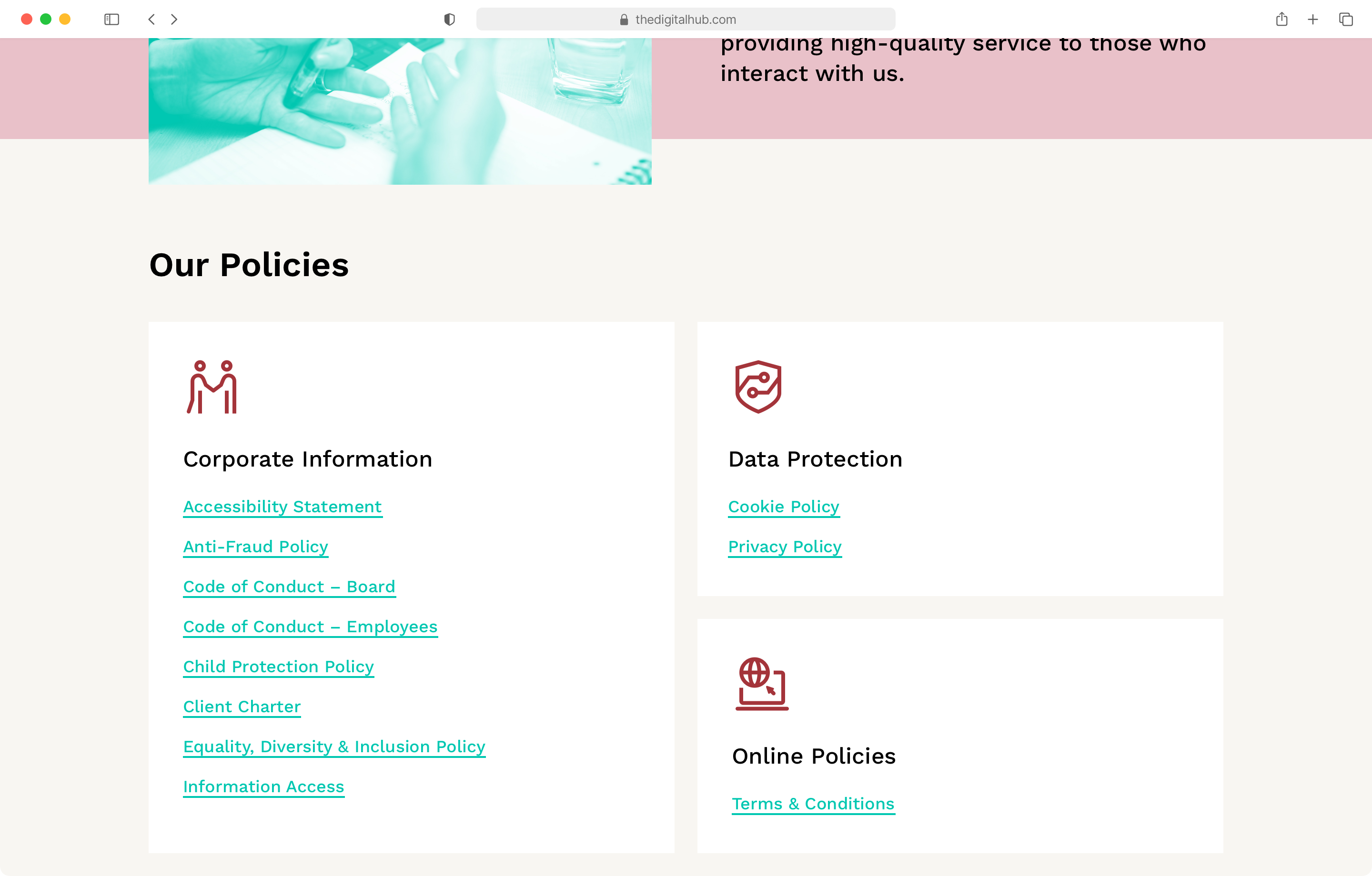
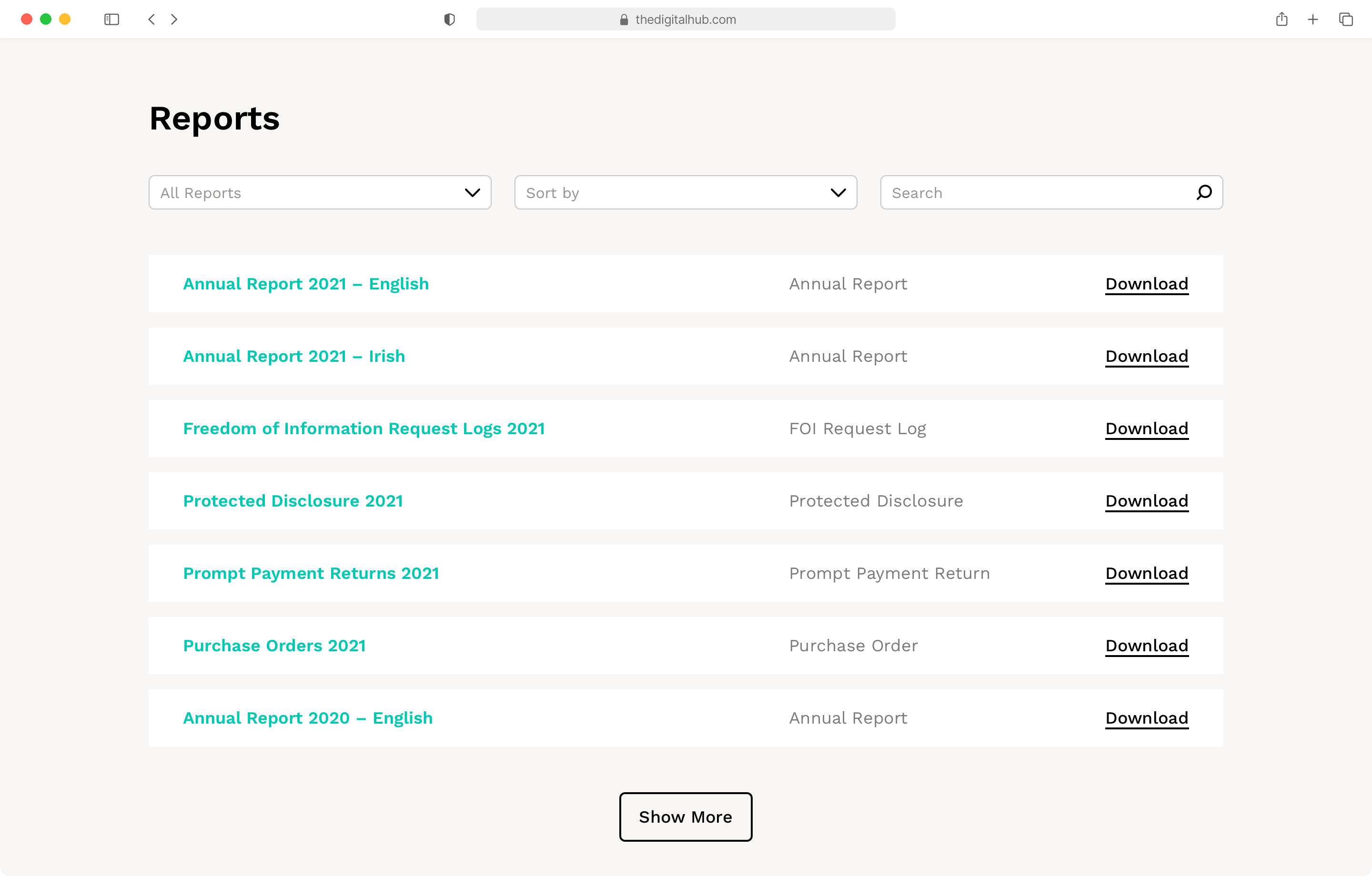
The Digital Hub Development Agency issues a variety of publications to provide an overview of the work they carry out and to demonstrate their commitment to high standards of corporate governance. Improved visibility, clear filtering and consistent naming conventions, helps both internal team members and external users to more easily access these policies and reports — all helping to improve the service to those who interact with the Digital Hub Development Agency.
"Delighted with how the new website is working out.
Lots of great feedback and analytics show people are finding the right content much easier."
— Melissa Meehan, Marketing & Communications Manager, The Digital Hub
A streamlined member area
A Member Area for companies and organisations at The Digital Hub was completely redesigned, with reduced complexity, increased speed and stronger security.
The dashboard contains key priority links for member engagement — including Book a Room, Facilities Helpdesk, Broadband Helpdesk, Request Access Card, Post Job Vacancy, Submit News, Client Services Team Link and Essential Information links — to ensure members have everything they need to focus on doing their best work.
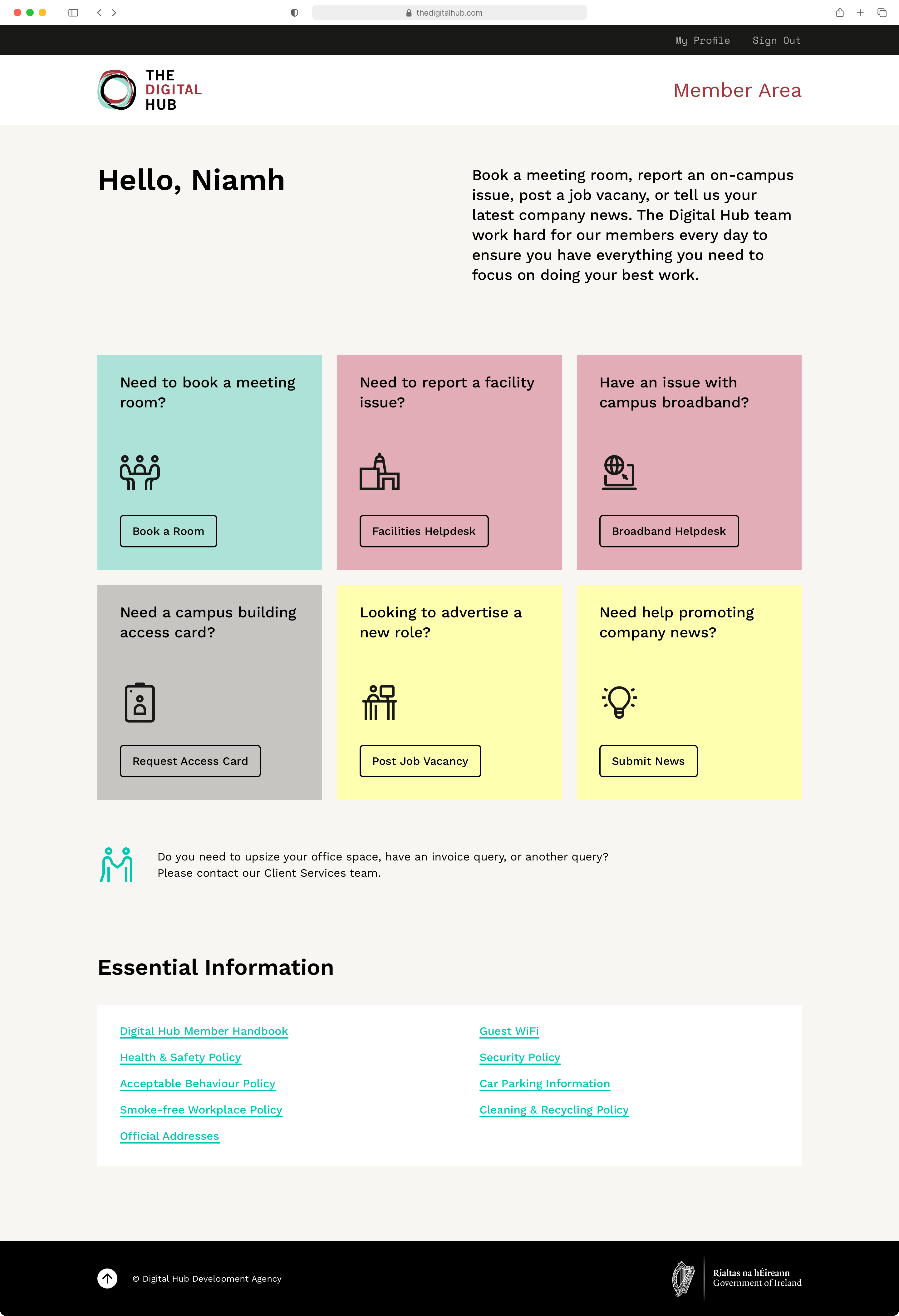
Key tasks and information highlighted on the Member Area dashboard
At the forefront of digital technology services
Helping to boosting Ireland’s reputation as a global player in the technology and digital content industries.
Credits
Creative direction & design: Marc Walsh
Frontend development: Katie West
Backend development: David Mihalovics
Producer: Philip Lynch
Collaborators
Melissa Meehan, Marketing & Communications Manager, DHDA
Julian Ellison, Enterprise Development Manager, DHDA